
"Apple [UI design] took on an impossible task… And even if the premise was solid, I still wish I could say: they did the best they could, given the goal. But that’s not true either: they did a poor job consistently applying the metaphors and designing the icons themselves.”
 Yup. Tahoe's redesign, perfectly summarized: self-inflicted problems, executed poorly, contradicting their own stated principles.
Good riddance to its DRI. Fingers crossed for a better macOS 27.
Yup. Tahoe's redesign, perfectly summarized: self-inflicted problems, executed poorly, contradicting their own stated principles.
Good riddance to its DRI. Fingers crossed for a better macOS 27.
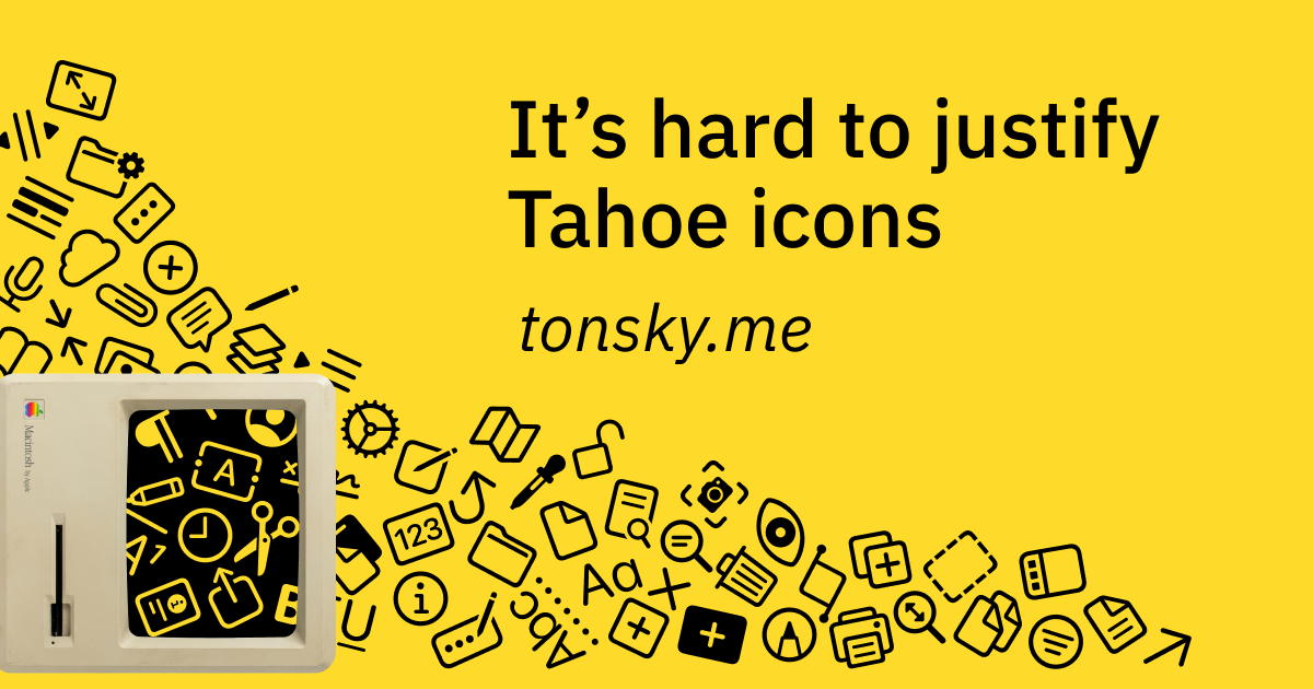
tonsky.me
It’s hard to justify Tahoe icons
Looking at the first principles of icon design—and how Apple failed to apply all of them in macOS Tahoe