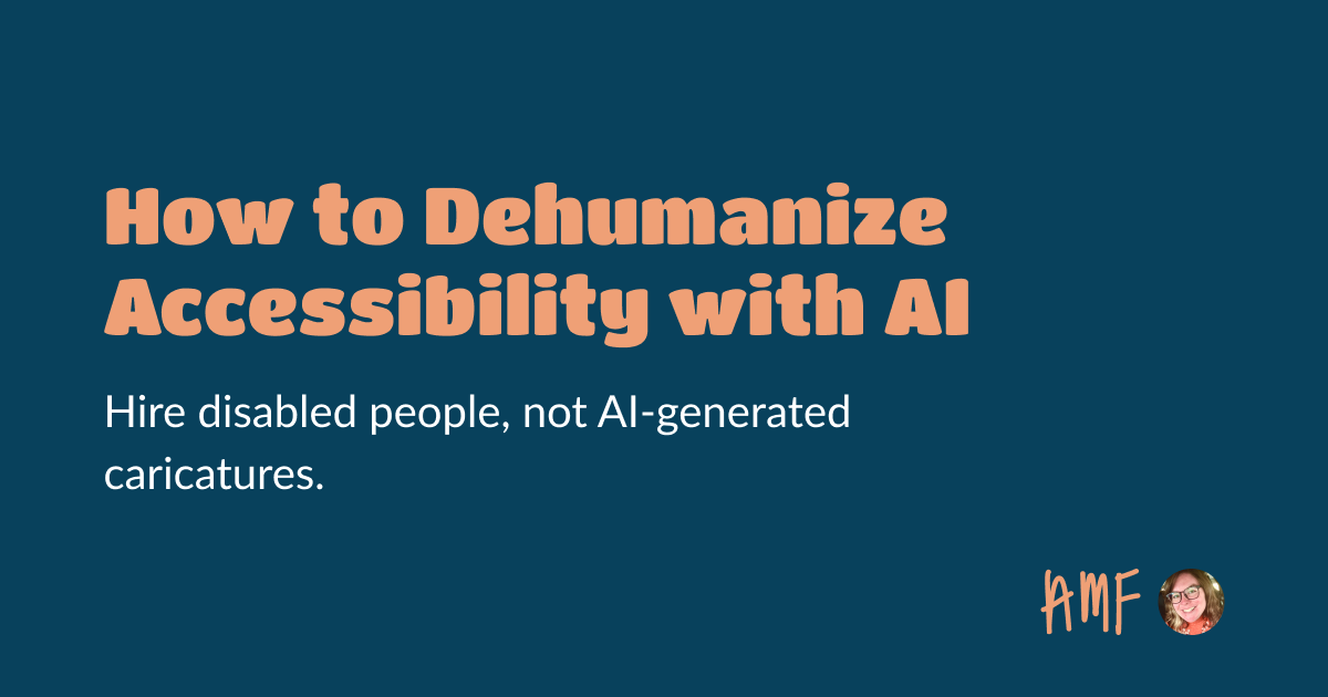
Repeat after me: generative AI does not and cannot ever represent disabled people. A great article by Ashle Emboyer, who explains why solutions who pretend to do that are dehumanizing the lived experiences of disabled people by replacing authentic stories with synthetic, generative AI outputs. Please, read the full article:
What is it like to use a screen reader on an inaccessible website? Navigating is like using a narrow-beamed flashlight in a dark, constantly changing room—you must carefully piece together a mental map while unseen changes make it harder to orient yourself. Dynamic content without clear cues, like vague "aria-live" alerts, can add confusion, but precise and context-aware descriptions can greatly improve navigation and understanding. A great analogy by Craig Abbott.
Coding Font: compare coding fonts 2 by 2 in a couple of rounds until you find the one that you’ll love coding with. So, which one did you end up with? https://www.codingfont.com/ image
There's a lot of misconceptions about disabilities, and often underestimate how broad this spectrum is. Demelza Feltham (Tetralogical) offers an introduction to the different types of permanent, temporary and situational disability, organized in seeing, hearing, moving, thinking categories. A must-read to better understand how inaccessibility will impact all us, at some point. Foundations: types of disability (8min)
People think there's a secret sauce behind increasing visibility, especially on social media, where some gurus sell you tips and tricks. This article resonates a lot, because, I’ve mostly, the same strategy (even though I don’t like to call this a strategy to be honest). Just like Kent Dodds, I’m curious, share what I like, share what I learn, try to demystify things, and share often. That's it. Happy to see I’m not the only one with such a mindset!
So, I guess I now need to add a "don't edit my speaker shot photos with AI without my consent and running the result by me before publishing it first" addition to my speaker conditions? https://xcancel.com/elizlaraki/status/1846252781851890026
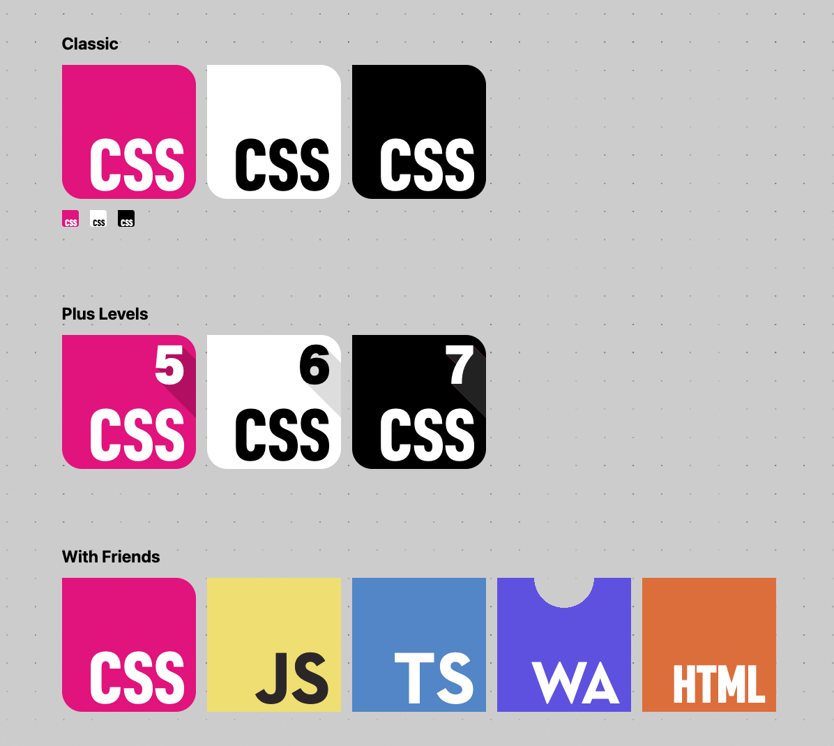
Searching for a New CSS Logo... I really like the hotpink proposal with the 3 little radii, yes please! image
Color accessibility might sound scary when you start. There are 3 things to be careful about: - Don’t use color as the only visual means of conveying an information, action, etc. (WCAG 1.4.1) - Ensure sufficient contrast ratio between text and their background. (WCAG 1.4.3): 4.5:1 for text (strictly) smaller than 24px, or 19px bold and 3:1 for text larger or equal to 24px, or 19px bold
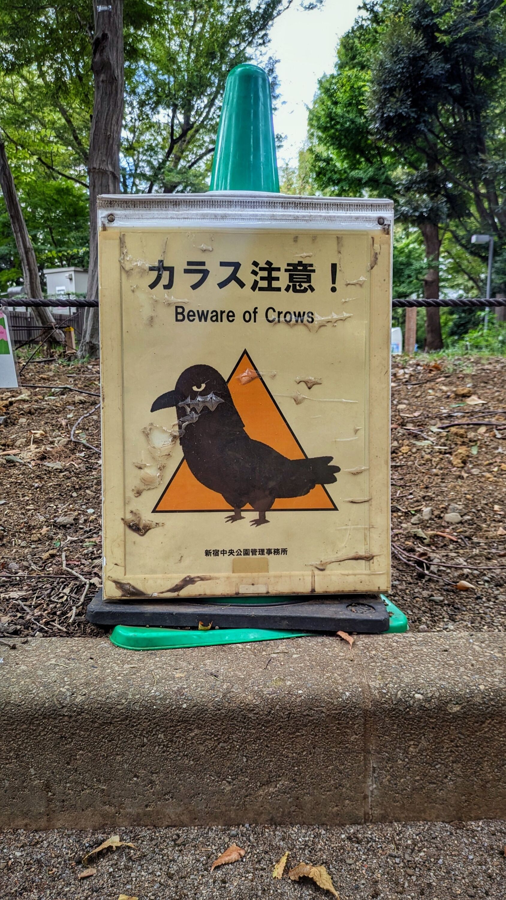
I would like to meet the designer and congratulate them, because this is perfection. The nasty judgmental look of the crow is amazing. No notes. image
School year starts again: if you are a designer who needs a little bit of help, here's an article from my archives on how to find your first UX Job, from choosing the structure, to reaching out to other people, etc.