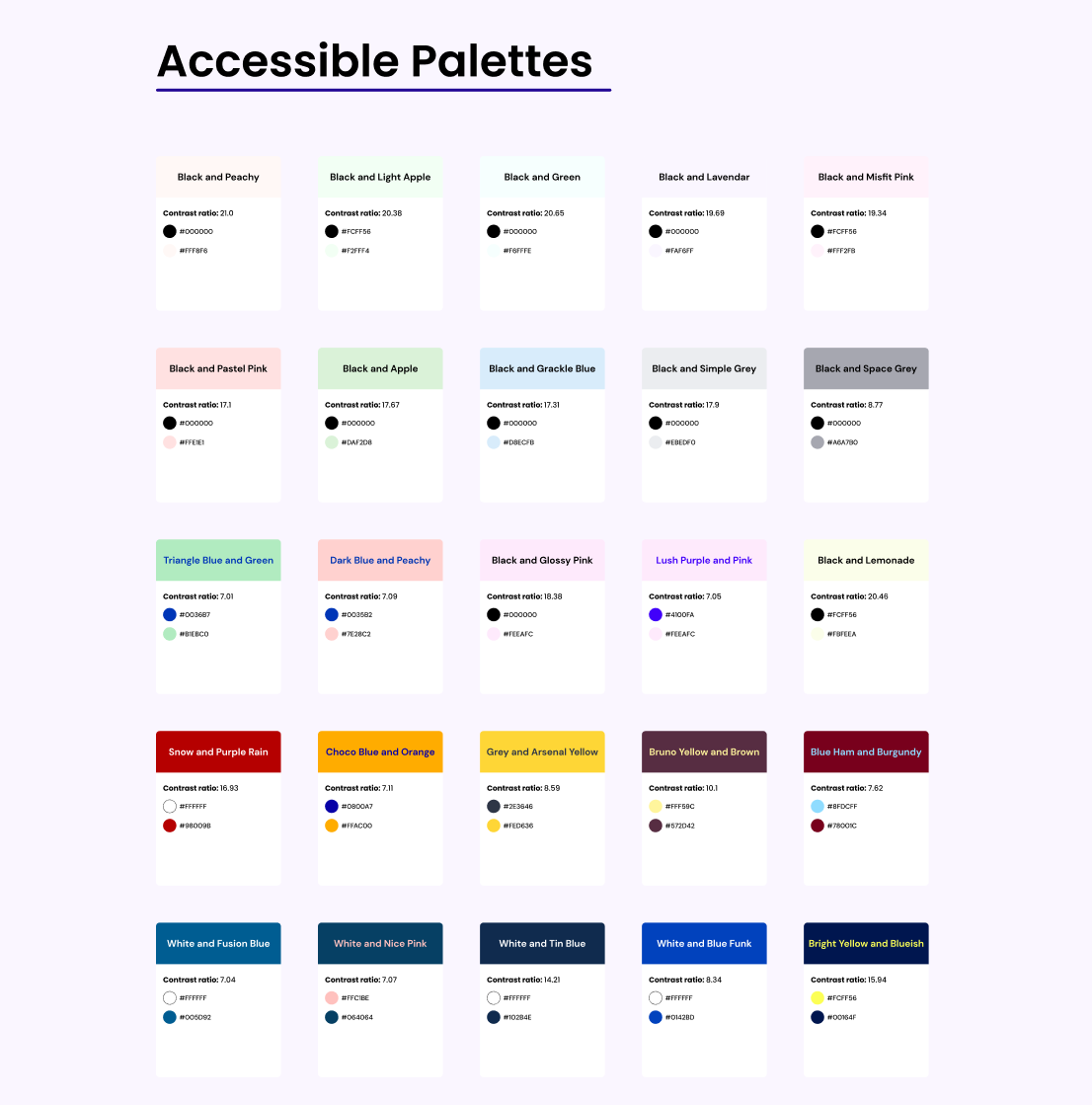
"Boohoo I can't use pastel" and "Accessible color palettes are ugly" are things I hear often. But, it's not true! If want some inspiration for accessible color combinations, Furquan Ahmad put 50+ ideas in a nice Figma file: https://www.figma.com/community/file/909176640411029401 image
In case you were still thinking about using a placeholder instead of a label, here's an example of why it's a very bad idea: I have to empty the field to know what was expected. And if you need more information about placeholders, here's a good place (haha) to start: https://uxdesign.cc/stop-using-placeholders-3b9f362a50d8 image
Looking for a monospaced pixel font with a lo-fi technical vibe, serving old school interfaces? Meet Departure Mono. I love it soooo much! image