The OKR Parallel Universe Syndrome ![](https://m.stacker.news/105287) Company Strategy is written (and maybe communicated). Company OKRs are written based on KPIs and some strategic topics. Teams model their OKRs after the company OKRs. The company insists that other things are "also important." So when teams share their roadmap items connected to the OKRs, but get pushback on where the work on these "other important things" is happening. 
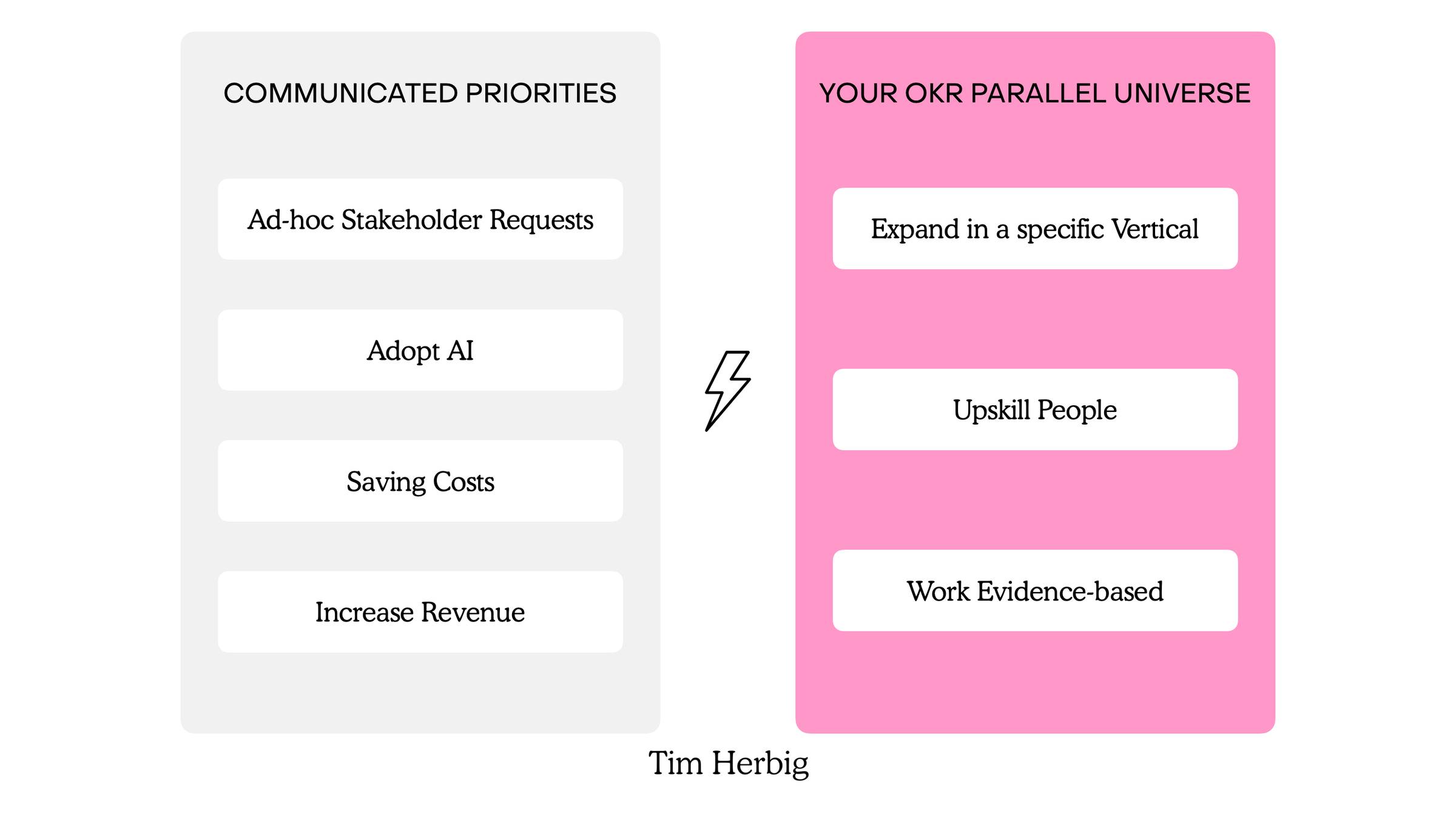
I call this the OKR Parallel Universe Syndrome. You may not have heard of it, but I'm sure you've experienced it.
Digital Solitude ![Only one person can use this site. If more than one user connects, it fails for everyone. Current visitors: X... please try again later.](https://m.stacker.news/105274)
Surfing Complexity: Easy will always trump simple > evolution is terrible at designing simple systems: I think biological systems are the most complex systems that we humans have encountered. And yet, they work astonishingly well. Now, I don’t think that we should design software the way that evolution designs organisms. Like Hickey, I’m a fan of striving for simplicity in design. But I believe that complex systems, whether you call them complected or tangled, are inevitable, they’re just baked in to the fabric of the adaptive universe. I also believe that easy is such a powerful heuristic that it is also baked in to how we build and involved systems. That being said, we should be inspired, by both biology and Hickey, to have useful tools at-hand. We’re going to need them.
Fresh from @Kontext: "Bitcoin Media Kit". #Stories are visual journeys on screens. A Narrative for #designtips & #creativity.
"Fonts In Use - An independent archive of typography." revealed by @carter. Inspiration transforms hidden beauty. Pure brilliance for #design & #creativity.
"💥 JABBB #50 :: Bitcoin Beholder" by @deSign_r. Modern #trends meet timeless principles. Stylish evolution for #design & #creativity:
Fresh from @deSign_r: "the peculiar case of japanese web design". #Stories are visual journeys on screens. A Narrative for #designtips & #creativity.
💰This week Comics & Meme ~Design bounty #50 is about : # Bitcoin Beholder image Check it out here
the peculiar case of japanese web design https://sabrinas.space ![](https://m.stacker.news/105162) > Japanese writing systems share a large set of logographic characters with Korean and Chinese that are collectively titled CJK characters. There are a lot of these characters and not many designers are willing to create fonts for them compared to Latin fonts. So, Japanese web designers have less fonts to choose from and they can’t use capitalization to form visual hierarchies. I reckon these limitations not only apply to web, but to any creative output. It is fascinating how language frame the way we communicate and how. Any Japanese around here?
Has efficiency killed beauty? https://uxdesign.cc/aesthetics-in-design-or-how-we-lost-our-connection-with-the-beautiful-540786b974fd ![](https://m.stacker.news/105161) As interface designers, we know that one of the most crucial dimensions of design — and of the user experience — is aesthetics. There is even a well-known psychological principle that captures this idea: the Aesthetic–Usability Effect (Nielsen Norman Group), which refers that people tend to perceive beautiful interfaces as more usable: # People tend to believe that things that look better will work better — even if they aren’t actually more effective or efficient. Over the past decade, however, our field has undergone a true revolution: the conversation has shifted heavily toward UX, research, testing, and metrics. As an example, let’s look at Google Trends data for the topic User Experience Design. While these are not absolute numbers, the relative interest clearly shows that since 2015, interest in UX has grown by nearly tenfold.