Smart one from @deSign_r: "Human Types - Artificial intelligence & Typography". Protects what words cannot. Function meets #designtips & #creativity:
"CoLLecTed* – Create your Portfolio website in 14 min" by @deSign_r for midnight #inspiration that demands expression. #Creative dedication for #designCommunity
CoLLecTed* – Create your Portfolio website in 14 min ![](https://m.stacker.news/98528) Сlean, free, and easy-to-use portfolio website designed to help visual creators showcase their work Built with Next.js and Sanity [Clone Repo Template]() # Built with customisation in mind Set custom colors for your website and use the content builder for your project pages ![](https://m.stacker.news/98526) ![](https://m.stacker.news/98527) # Deploy and launch Check out this quick 14-minute setup walkthrough video below. Build up a fresh portfolio website with me from deploy to launch [Clone Repo Template]()
Collected – Create your Portfolio website in 14 min ![](https://m.stacker.news/98528) Сlean, free, and easy-to-use portfolio website designed to help visual creators showcase their work Built with Next.js and Sanity [Clone Repo Template]() # Built with customisation in mind Set custom colors for your website and use the content builder for your project pages ![](https://m.stacker.news/98526) ![](https://m.stacker.news/98527) # Deploy and launch Check out this quick 14-minute setup walkthrough video below. Build up a fresh portfolio website with me from deploy to launch [Clone Repo Template]()
Human Types - Artificial intelligence & Typography ![](https://m.stacker.news/98519) 
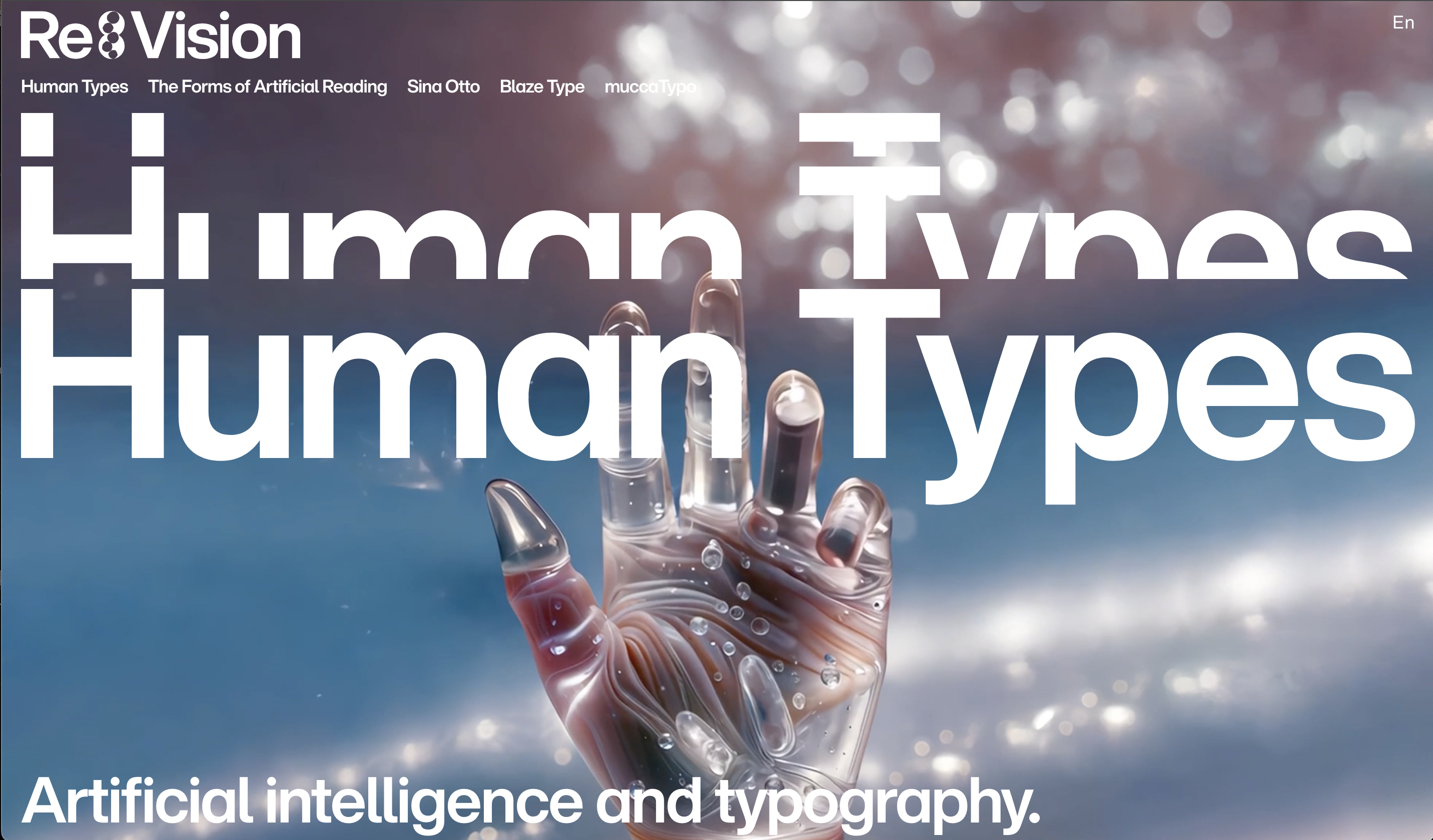
Human Types explores the interplay between humans and machines in typography and graphic design. Challenging generative AI and fleeting design trends, the series highlights the unique insights, expertise, and emotions of leading creatives, including Matthieu Salvaggio (Blaze Type), Matteo Bologna (muccaTypo), and Monotype’s Sina Otto. It emphasizes typography as a reflection of culture and identity, underscoring the essential humanity behind every typographic choice. ![](https://m.stacker.news/98520) Type Trends 2025. The latest in type design, from the Monotype Studio. [Download PDF report](📄.pdf) # Human Types: five takeaways for this brave new typographic world. | Humans are central to design.|| |---|---| | Design is a verb; design is human. It addresses human needs, wants, and dreams. It’s the action of reframing, innovating, executing, and curating as we work to find what’s new, what fits, what excites us. AI is great (and getting better) at execution. But human creativity is the driver, humanity the guiding light.|![](https://m.stacker.news/98521)| | AI-based design isn’t the future — it’s here and it’s now.|| |---|---| | The question is no longer “if” or “when,” but “how” and “why.” If adopted thoughtfully, AI can act as our creative partner, working alongside us to add to our human creative capacities. Monotype’s experiments using AI, though early days, have produced amazing results. Expect more and expect it soon.|![](https://m.stacker.news/98523)| | Typographic abundance makes new tools essential.|| |---|---| | Today, we have more typography available to us than ever before. This makes finding the type we want difficult. Seasoned typographers can only remember a couple thousand fonts by eye. AI can learn them all — and can and will help non-type-obsessives find their very particular needle in a very large haystack.|![](https://m.stacker.news/98524)| | Don’t just expect more fonts — expect to see more lettering, too.|| |---|---| | AI is getting pretty great at lettering, creating beautiful letterform lockups. It will get better and better. Look for a future where expressive letters are called into being without the use of fonts.|![](https://m.stacker.news/98525)| |Typography is becoming more personal.|| |---|---| | Printed type provides a standard, static experience that is the same for everyone. This gives designers control, allowing them to craft a particular experience. There are advantages to knowing how your audience will encounter your work. But user needs can vary widely. AI provides us with the possibility of a more personalized digital future, with dynamic text that can respond to our individual preferences and needs, changing fonts, spacing, color, design, and even language to fit our circumstances. What impacts will we see in the worlds of design and culture as we shift to more individualized typographic experiences?|![](https://m.stacker.news/98522)|
Vision from @deSign_r: "Designing for the Eye – Optical Corrections in Architecture and Typography". #Presentation transforms ideas into poetry. Persuasive #art for #designer & #cretive #brains.
"NormCap, open source multiplatform application to capture/read text from images" crafted by @4a6ae349ec. Breaking conventions apart, one #design at a time, with #creativity.
Designing for the Eye – Optical Corrections in Architecture and Typography ![](https://m.stacker.news/98365) People like Paul Renner, who design and draw typefaces, have always known about the intri­cacies of human perception and how to work in service of it. To illustrate all of this, let’s look at Renner’s 1927 typeface Futura. Futura is what is known as a geometric sans-serif – a type­face that looks as if it was drawn with a ruler and com­pass. It is made out of straight lines, sharp corners, and seemingly perfect cir­cles and semi-circles. You might think it far-fetched to draw a con­nec­tion between ty­pog­ra­phy and architecture, but the two fields are actually more similar than you might have expected. The typesetter or ty­pog­ra­pher has to plan a layout and a structure in which ele­ments like paragraphs, pictures, and head­ings fall into place. Similar to the dif­fer­ent parts of a building, these elements depend on one another to work both aesthetically and tech­ni­cal­ly. And just as a building’s foundation defines the constraints for what can be built above it, the choice of typeface – and how it is used at its small­est size – usually defines the layout grid, and thus how the rest of a book will be typeset. ![](https://m.stacker.news/98366) ![](https://m.stacker.news/98364)
Designing for the Eye – Optical Corrections in Architecture and Typography ![](https://m.stacker.news/98365) People like Paul Renner, who design and draw typefaces, have always known about the intri­cacies of human perception and how to work in service of it. To illustrate all of this, let’s look at Renner’s 1927 typeface Futura. Futura is what is known as a geometric sans-serif – a type­face that looks as if it was drawn with a ruler and com­pass. It is made out of straight lines, sharp corners, and seemingly perfect cir­cles and semi-circles. You might think it far-fetched to draw a con­nec­tion between ty­pog­ra­phy and architecture, but the two fields are actually more similar than you might have expected. The typesetter or ty­pog­ra­pher has to plan a layout and a structure in which ele­ments like paragraphs, pictures, and head­ings fall into place. Similar to the dif­fer­ent parts of a building, these elements depend on one another to work both aesthetically and tech­ni­cal­ly. And just as a building’s foundation defines the constraints for what can be built above it, the choice of typeface – and how it is used at its small­est size – usually defines the layout grid, and thus how the rest of a book will be typeset. ![](https://m.stacker.news/98363) ![](https://m.stacker.news/98364)
What Problems to Solve - By Richard Feynman _A former student, who was also once a student of Tomonaga’s, wrote to extend his congratulations. Feynman responded, asking Mr. Mano what he was now doing. The response: “studying the Coherence theory with some applications to the propagation of electromagnetic waves through turbulent atmosphere… a humble and down-to-earth type of problem.”_