New experiment from @deSign_r: "UX Review of Peugeot’s New Interior: When Design Ambition Meets Software Reality". Technology meets beauty. Mind-bending #design & #creativity:
Fresh insight from @deSign_r: "The Perils of ‘Design Thinking’". The ancient arts lives on. Explore #design & #creativity:
The bodega-influenced visual language of an outsider campaign # Zohran Mamdani’s Campaign Logo Looked Nothing Like a Campaign Logo ![](https://m.stacker.news/98267) Nobody would credit Zohran Mamdani’s campaign graphics for his win, but they were, as was his campaign, like nothing else in politics. First, there’s the saturated color palette: A royal-blue field — brighter and more electric than [Biden blue](https://archive.is/CqAyo) — backs up ochre-yellow letters with vermilion drop shadows. (Occasionally, the colors are reversed, with the ochre as the background.) The typeface has curvilinear flourishes and flares that suggest the hand-painted lettering on a storefront sign far from politics, like the [1-Shot lettering enamel]() on a Washington Heights awning reading “COLD BEER.” Other campaign materials are equally as memorable, especially the insouciant (and unofficial) [HOT GIRLS FOR ZOHRAN]() T-shirt. I cannot for the life of me tell you what Andrew Cuomo’s logotype looks like, and heaven knows you never saw a HOT GIRLS FOR CUOMO shirt anywhere. ![](https://m.stacker.news/98268) ![](https://m.stacker.news/98269) ![](https://m.stacker.news/98270) ![](https://m.stacker.news/98272) ![](https://m.stacker.news/98271)
The bodega-influenced visual language of an outsider campaign # Zohran Mamdani’s Campaign Logo Looked Nothing Like a Campaign Logo ![](https://m.stacker.news/98267) Nobody would credit Zohran Mamdani’s campaign graphics for his win, but they were, as was his campaign, like nothing else in politics. First, there’s the saturated color palette: A royal-blue field — brighter and more electric than [Biden blue]() — backs up ochre-yellow letters with vermilion drop shadows. (Occasionally, the colors are reversed, with the ochre as the background.) The typeface has curvilinear flourishes and flares that suggest the hand-painted lettering on a storefront sign far from politics, like the [1-Shot lettering enamel]() on a Washington Heights awning reading “COLD BEER.” Other campaign materials are equally as memorable, especially the insouciant (and unofficial) [HOT GIRLS FOR ZOHRAN]() T-shirt. I cannot for the life of me tell you what Andrew Cuomo’s logotype looks like, and heaven knows you never saw a HOT GIRLS FOR CUOMO shirt anywhere. ![](https://m.stacker.news/98268) ![](https://m.stacker.news/98269) ![](https://m.stacker.news/98270) ![](https://m.stacker.news/98272) ![](https://m.stacker.news/98271)
The Perils of ‘Design Thinking’ How did the concept become the solution to society’s most deeply entrenched problems? ![](https://m.stacker.news/98266) On the first day of a required class for freshman design majors at Carnegie Mellon, a professor stood in front of a lecture hall of earnest, nervous undergraduates and asked, _“Who here thinks that design can change the world?”_ Several hands shot up, including mine. After a few seconds of silence, he advanced to the next slide of his presentation: a poster by the designer Frank Chimero that read, _"Design won’t save the world. Go volunteer at a soup kitchen, you pretentious fuck"_.
UX Review of Peugeot’s New Interior: When Design Ambition Meets Software Reality ![](https://m.stacker.news/98153) 
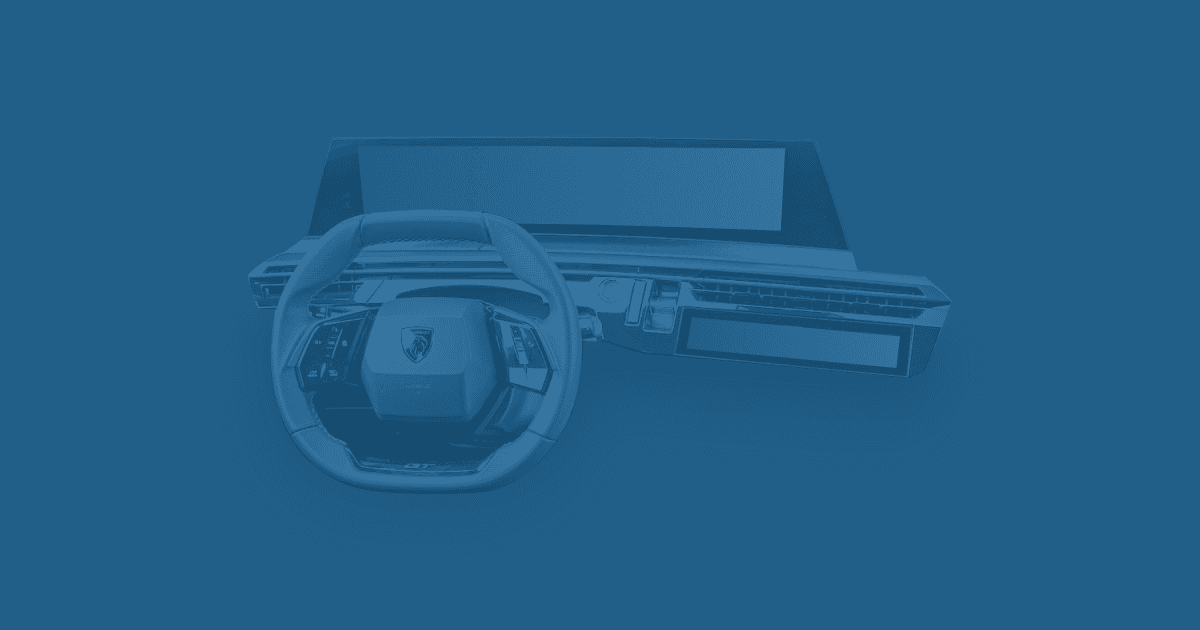
The Panorama i-Cockpit is the latest iteration of the i-Cockpit that debuted in the 2012 Peugeot 208. The i-Cockpit's main innovation is that the instrument cluster is positioned above the steering wheel rather than behind it. Therefore, it's unobstructed and closer to the driver's line of sight. The steering wheel is small, allowing enough legroom and visibility on the instrument cluster. After a week of use, it became clear that the software couldn't match the impressive hardware.
Insight from @Scoresby: "10 July, 1400 UTC: Fedimint Web Wallet Design Call #1". Growing your soul. A bliss for #creative #design:
@carter explores "Alternative Layout Systems" - chasing the perfect #aesthetic through depths. Visual secrets for #design & #creativity.
"(Linux tutorial) Script to batch optimize images inside folder to save space" revealed by @4a6ae349ec. Inspiration transforms hidden beauty. Pure brilliance for #design & #creativity.
@kr pushes boundaries with "The Cybertruck of Cookware?" - where #bold becomes beautiful. Ignite your imagination, #design & #creativity: