
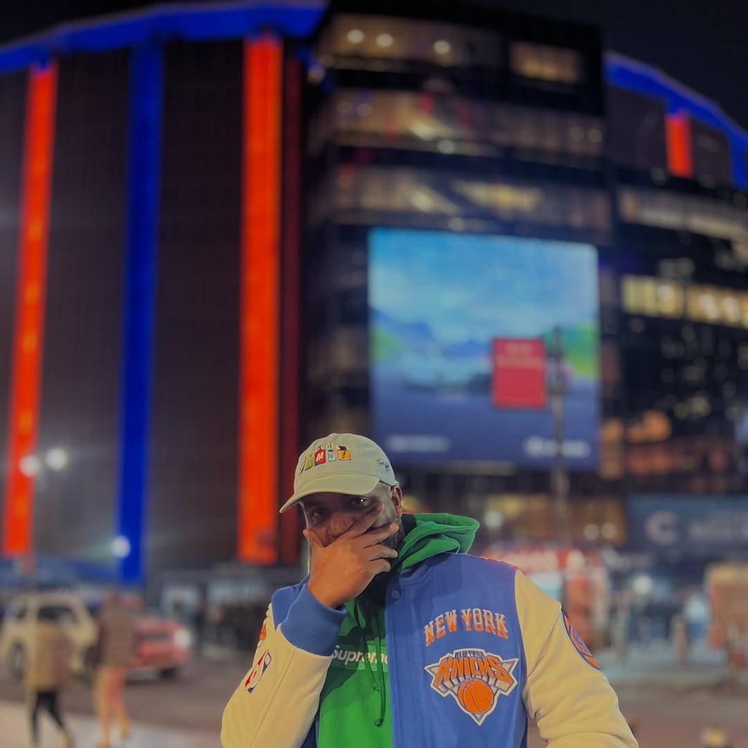
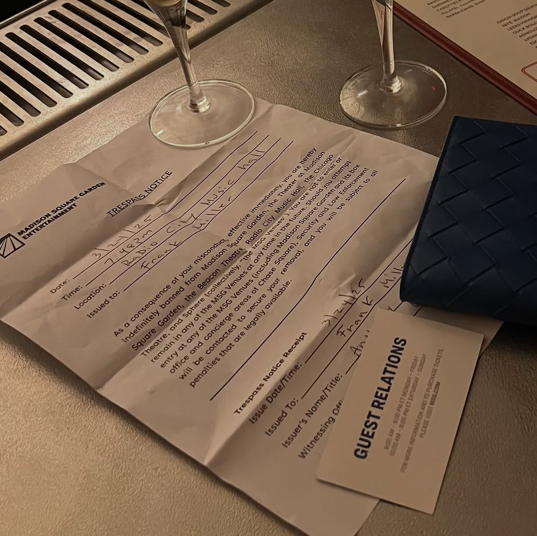
Madison Square Garden’s surveillance system banned fan over his T-shirt design

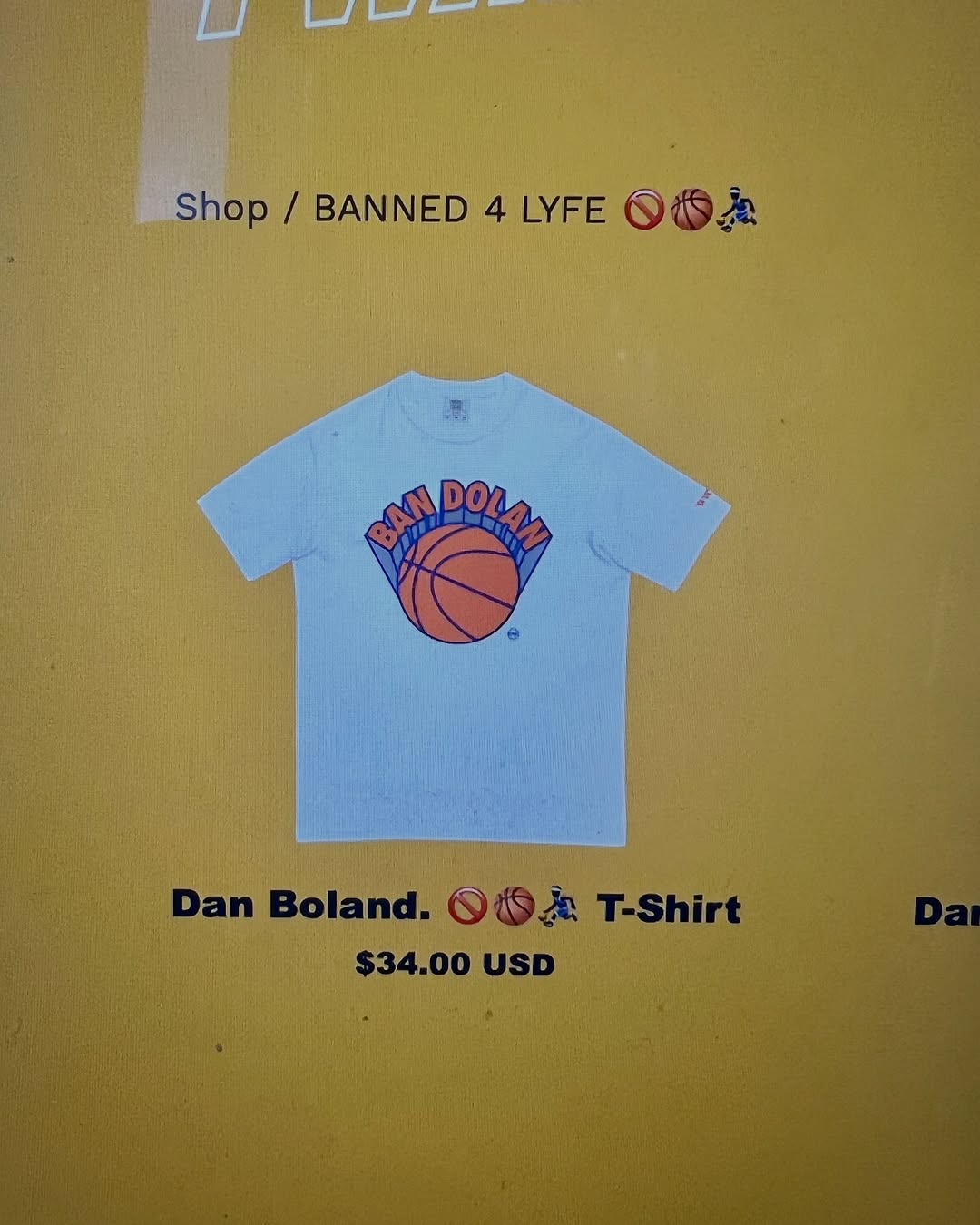


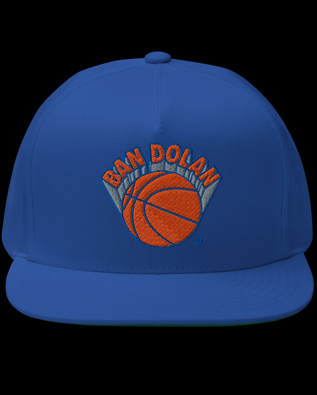
One could easily read **BAN DOLLAR** 🚫🤑💸
Merch available here


One could easily read **BAN DOLLAR** 🚫🤑💸

Merch available here  originally posted at
The Verge
Madison Square Garden’s surveillance system banned this fan over his T-shirt design
MSG uses tools like facial recognition on attendees.
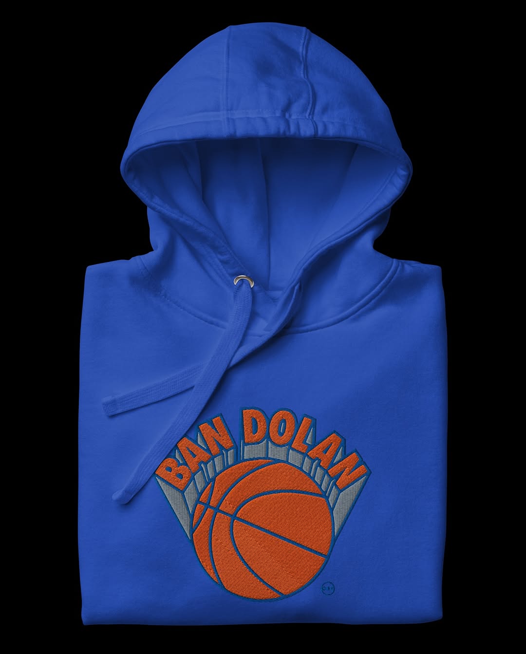
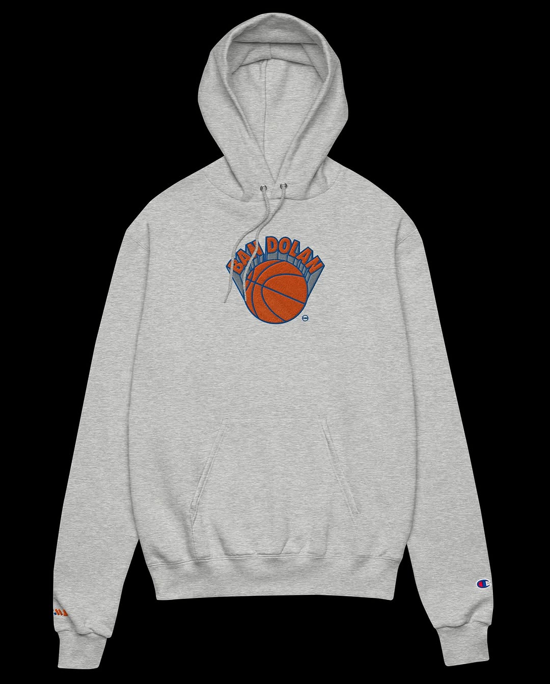
FWMJ.shop
BANNED 4 LYFE 🚫🏀⛹🏿♂️
Browse all products in the BANNED 4 LYFE 🚫🏀⛹🏿♂️ category from FWMJ.shop.
Stacker News
Madison Square Garden’s surveillance system banned fan over his T-shirt design \ stacker news
One could easily read BAN DOLLAR 🚫🤑💸 Merch available here https://shop.fwmj.com/category/banned-4-lyfe


 The #absurdity of spending countless hours crafting #interactive #interface in a medium no one will ever use.
Originally posted
The #absurdity of spending countless hours crafting #interactive #interface in a medium no one will ever use.
Originally posted